When conducting your Technical Analysis of Stock Trends, the first thing you need to decide is what Chart Type you will use. Whether you use Bar Charts or Candlestick Charts you are going to want to analyze the price action much closer. There is a range of different ways you can analyze price charts, and using Chart Overlays is a great way to compare past price behavior and gain a clearer picture as to where future price action is likely to move.
Chart Overlays
Below are some of the more common chart overlays, used by traders when conducting their Technical Analysis of Stock Trends:
Support Lines
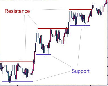
A Support Line is a horizontal line drawn at a price level where increased buying pressure occurs as price is moving downward, which causes price to bounce off this level in the past and is likely to provide some level of support to price moving lower in the future.
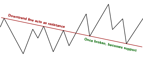
Resistance lines once broken can often form new support, and vice versa with Support Lines which are broken becoming new Resistance Lines
Resistance Lines
A Resistance Line is a horizontal line drawn at a price level where increased selling pressure occurs as price is moving upward, which causes price to bounce back off this level in the past and is likely to provide some level of resistance to price moving higher in the future.
Trend Lines
Trend Lines are a straight line drawn through 2 or more price pivot points.
 The Support Trend Lines are normally connecting the lower price pivot points which swing higher, and the Resistance Trend Lines are normally connect the higher price pivot points swinging lower as indicated in the image. They are always drawn ascending or descending.
The Price is generally contained within the Trend Lines until the trend is violated(broken) or if it accelerates (breakout).
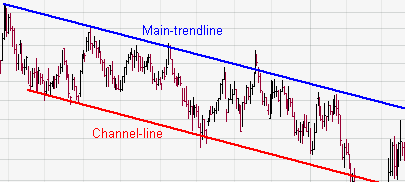
Trend Line Channels
Trend Line Channels are simply 2 trend lines drawn parallel to each other, where the price is generally contained within the Channel, until a breakout or break down.
Moving Averages
Moving averages or Rolling Averages are average of a series preceding values. For example a 10 day Simple Moving Average of the Close Price is an average of the last 10 preceding close prices. Each new day this calculation is made which plots a series of points which are connected with a curved line on the price chart.
Some of the more common settings are 10, 20, 50, 100 & 200 day Moving Average, and they are commonly used as a crossover indicator. Though it is important to know Moving Averages are a lagging indicator.
There are 3 different types of Moving Averages, they are:
- Simple Moving Average (SMA)
- Cumulative Moving Average
- Weighted Moving Average
- Exponential Moving Average
Bollinger Bands
Bollinger Bands were invented by John Bollinger in the 1980’s and have become extremely popular the traders around the world when conducting their Technical Analysis of Stock Trends. Bollinger Bands are adaptive bands which are overlaid on a Price Chart, and are great for measuring relative highness or lowness in price to previous price action. Bollingers can also be overlaid over other indicators to show relative high and lows.
Bollinger Bands are calculated with a formula, and they normally consist of 3 bands which are:
- Middle Band – is usually a (X) periods SMA. Other Moving averages types may be used.
- Upper Band – is above the Middle Band and is (X) periods (SMA) + (Y) x Standard Deviation
- Lower Band – is below the Middle Band and is (X) periods (SMA) – (Y) x Standard Deviation
The common setting for Bollinger Bands is: 20 day Bollinger Bands with 2 Standard Deviations, though other settings may be used.
So stay tuned for next weeks post on “Technical Analysis of Stock Trends #3 – Chart Indicators”
Cade Arnel
Trend Hunter
www.globaltrendtraders.com 2009-2010
Leave a Reply